


Choosing the right font for headings can make or break your design. Whether you’re working on creating a website, a marketing campaign, or a print layout, headings need to be eye-catching and easy to read. The right font sets the tone and enhances readability, while the wrong font can confuse readers or make your design look unprofessional.
In this article, we’ll explore the best fonts for headings, from classic serif choices to modern sans-serif options. We’ll also discuss body font sizes, line heights, and font pairing tips to ensure your design stands out. If you’re looking to make your content visually appealing and engaging, read on!
1. Choosing the Right Font for Headings
Selecting the perfect font for your headings is crucial for making your content visually appealing and easy to read. A well-chosen font enhances the overall web design, reinforces your brand identity, and ensures clarity. Below are key factors to consider when choosing a font for your headings.
- Readability: The primary function of a heading is to grab attention and convey information quickly. A good heading font should be clear, legible, and easy to read at a glance. So, avoid overly decorative or intricate fonts that may reduce readability, especially on smaller screens.
- Brand Identity: Your font should reflect the personality and values of your brand. A modern, clean sans-serif font suits tech and corporate brands, while an elegant serif font may be better for luxury or editorial designs. Therefore, choose a font that aligns with your overall branding strategy.
- Project Goals: Different projects require different font styles. A formal document may need a traditional serif font, while a creative or playful project may benefit from a bold, unique font. Consider the message you want to convey and select a font that supports your content’s tone.
- Target Audience: Understanding your audience is essential when selecting a heading font. A younger, tech-savvy audience may prefer sleek and modern fonts, while a more mature or professional audience may appreciate classic and refined typefaces. Ensure your font choice resonates with the people you are trying to reach.
By considering these factors, you can choose a heading font that enhances your design while ensuring readability and brand consistency.
Know about: How Many Tertiary Colors Are There
2. Serif vs Open Sans Serif: Which One to Choose?
Choosing between serif and sans-serif fonts for headings depends on the tone and style of your design. Each font type has unique characteristics that influence readability and brand perception.
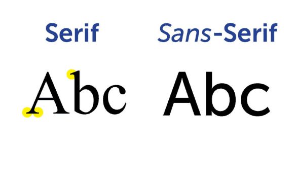
Let’s break them down.
Serif Fonts: Classic and Elegant
Serif fonts feature small decorative strokes at the ends of letters, giving them a more traditional and refined appearance. These font for headings are often associated with sophistication, reliability, and heritage. That’s why they are commonly used in:
- Print materials
- Books
- Newspapers
- Magazines
- Luxury branding
If you want your design to feel formal, elegant, or timeless, a serif font may be the perfect choice.
Sans Serif Fonts: Modern and Clean
On the other hand, sans serif fonts do not have decorative strokes, resulting in a clean and contemporary look. These fonts prioritize clarity and readability, making them ideal for:
- Websites
- Digital content
- Mobile apps
- Modern branding
Sans-serif fonts convey a minimalist, approachable, and professional feel. They are a great option if you want your headings to appear sleek and easy to read across different screen sizes.
The decision to choose between the two depends on the overall style, audience, and purpose of your project. If you aim for a traditional, sophisticated aesthetic, go with a serif font. If you prefer a modern, minimal, and highly readable design, opt for an open sans serif font.
Learn about: What Are Primary Colors in Web Design
3. Popular Font Families for Headings
Choosing the right font family for headings is essential for creating a visually appealing and readable design. Some fonts are versatile and work well across different mediums, while others are more suited for specific styles. Below are some of the most popular font families for headings, each offering a unique look and feel.
Open Sans: Versatile and Readable

Open Sans is a widely used sans-serif font known for its clean and modern appearance. It works well for both headings and body text, making it a great all-around choice for websites, presentations, and branding materials. Its neutral yet professional look ensures readability across various devices and screen sizes.
Montserrat: Modern and Bold

If you’re looking for a font that stands out, Montserrat is an excellent option. This sans-serif typeface features geometric letterforms and a contemporary feel, making it perfect for titles, branding, and digital designs. It’s a great choice for modern websites and marketing materials that need a strong, stylish presence.
Merriweather: Classic and Elegant

Merriweather is a serif font designed for readability, even on digital screens. It has a traditional yet refined look, making it ideal for formal branding, editorial content, and websites that want a touch of sophistication. Its balanced design ensures that headings remain elegant and legible.
Lato: Friendly and Approachable

Lato is a sans-serif font with a warm and welcoming style. It strikes a balance between professionalism and personality, making it perfect for headings in corporate designs, blogs, and online publications. Its versatility allows it to work well in both bold headings and subtle subheadings.
Playfair Display: Stylish and Sophisticated

For a touch of luxury and elegance, Playfair Display is an excellent serif font choice. Its high-contrast strokes and classic design make it ideal for fashion websites, magazines, and high-end branding. If you want your headings to exude sophistication, this font is a great pick.
Each font family has its unique strengths. However, the key is to select a font that aligns with your design goals and brand identity.
Check out: Role and Importance of Whitespace in Figma to WordPress Conversion
3. Best Font Size and Line Height for Headings
Selecting the right font size and line height for headings is crucial for readability and visual balance. The right combination ensures that your text stands out while remaining easy to read. Below are some key factors to consider when setting the body font size and line height for headings.
Optimal Font Size: Striking the Right Balance
The average font size for headings typically ranges from 18 to 29 pixels. Larger headings grab attention, while smaller ones maintain subtlety. When choosing a size, consider the context, platform, and design hierarchy—for example, website headers may require larger fonts than printed documents.
Ideal Line Height: Ensuring Readability
Line height, also known as leading, should be 1.2 to 1.5 times the font size. This spacing ensures that text is not too cramped or too loose, improving legibility. A well-adjusted line height makes headings more readable and aesthetically pleasing, especially in multi-line headings.
Impact on Readability and Design
Proper font size and line height enhance the overall visual appeal of your content. Text that is too small or too tightly spaced can strain the reader’s eyes, while overly large or widely spaced text can look unstructured. Striking the right balance ensures a smooth reading experience.
Considering Font Style and Family
Different font families have varying x-heights and stroke weights, which affect their perceived size and spacing. A bold sans-serif font may need less line height, while a delicate serif font might require extra spacing for clarity. Always test different combinations to find the best fit for your design.
Learn: Common WordPress Website Design Mistakes to Avoid for Success
4. Best Fonts for Creating Impactful Website Headings
A well-chosen website font for headings enhances readability, aligns with the brand’s identity, and makes content visually appealing. Here are some of the best fonts for impactful website headings.
Arial: Classic and Versatile
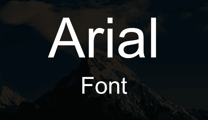
Arial is a widely used sans-serif font known for its clean, simple, and highly readable design. It works well for both headings and body text, making it a reliable choice for websites that need a professional and straightforward look.
Helvetica: Professional and Modern Design
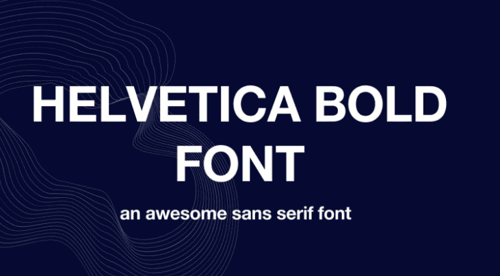
Helvetica is another popular sans-serif font that is often used for headings and titles. Its balanced proportions and crisp lines make it a perfect font for designers looking for a clean and sophisticated appearance. It’s ideal for websites that require a modern and polished touch.
Georgia: Traditional and Friendly Font

Georgia is a serif font that brings a traditional yet approachable feel to website headings. It is highly readable on digital screens, making it an excellent option for blogs, editorial sites, and professional websites that want a classic touch with warmth.
Futura: Sleek and Designer-Friendly

Futura is a geometric sans-serif font that designers prefer. It exudes modernity & minimalism and offers a sleek & futuristic appearance, making it a great choice for cutting-edge websites, tech brands, and digital agencies.
Bodoni: Elegant and Stylish
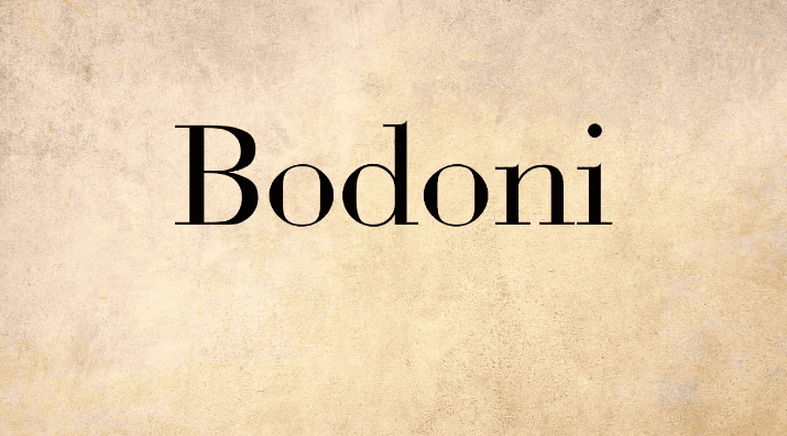
Bodoni is a high-contrast serif font known for its bold, elegant design. It works well for websites that want a luxurious, fashionable, or artistic feel. This font is often used in modern web designs, high-end branding, and magazine-style layouts.
Other Notable Fonts
If you’re looking for more options, consider Times New Roman, Lucida Grande, and other Sans serif typefaces. These fonts provide varied styles and readability for different types of website headings.
Find out: Is WordPress Free
5. How to Create a New Typeface for Headings?
Creating a custom typeface for headings can help your brand or design stand out with a unique and personalized touch. A well-designed typeface enhances readability while aligning with your brand’s personality. Here’s how to develop a distinctive typeface for headings.
- Define Your Typeface’s Purpose: Before designing a new typeface, consider its intended use and style. A custom font should align with your brand identity, whether it’s for a modern website, luxury branding, or editorial content. A unique typeface adds originality and exclusivity to your design.
- Work with a Professional Font Designer: While you can create a typeface yourself, collaborating with a typographer or font designer ensures a polished and functional result. Professionals can craft fonts that are aesthetically pleasing, versatile, and technically sound for various applications.
- Ensure Legibility and Readability: A good typeface should be clear and easy to read across different sizes and screen formats. Designers often focus on medium to high contrast, which enhances visibility. Fonts with narrow proportions, clean lines, and smooth curves work well for digital and print designs.
- Experiment with Contrast and Proportions: Typography contrast plays a key role in readability. Consider medium contrast for a balanced look or high contrast for a bold, striking effect. Additionally, narrow letter proportions and refined spacing help maintain a sleek and modern appearance.
Definitive Guide: White Label Website Design Services for Agencies
6. Font Pairing for Headings and Body Text
Choosing the right font pairing for headings and body text is essential for creating a balanced and visually appealing design. A well-matched combination enhances readability and ensures a professional look. Here are some key principles to follow when pairing fonts.
- Create Contrast with Serif and Sans-Serif: Pairing a sans-serif heading with a serif body font creates a beautiful contrast that improves readability. The sans-serif font keeps the design modern and clean, while the serif font adds a classic and sophisticated touch to the body text.
- Use Bold Headings with Lighter Body Fonts: To establish a clear hierarchy, consider using a bold and striking font for headings while keeping the body text light and subtle. This contrast helps guide the reader’s eye and makes the content easier to scan.
- Maintain Consistency Throughout the Design: Once you choose a font pairing, ensure it remains consistent across your design. Using too many font combinations can make the layout look cluttered and unprofessional. Stick to one or two complementary fonts to maintain harmony.
- Experiment to Find the Perfect Match: Font pairing is both an art and a science. Try different combinations to see what works best for your design. Experiment with classic pairings like Montserrat & Merriweather or Open Sans & Lora to achieve the right balance.
Ultimate Guide: Latest WordPress Development Trends
7. Common Mistakes to Avoid in Heading Font Choice
Here are some common pitfalls to avoid when choosing a heading font.
- Avoid Using Too Many Different Fonts: Using multiple fonts in a single design can make your layout look cluttered and unprofessional. Hence, stick to one or two complementary fonts to maintain consistency and a cohesive visual identity.
- Don’t Use Fonts That Are Too Similar or Too Different: Fonts that look too similar can make your design appear redundant, while fonts that are too different can create a disjointed and unbalanced look. For simplicity, choose fonts with enough contrast to create visual interest but ensure they still complement each other.
- Ensure Readability in Various Sizes and Formats: A font may look great at large sizes, but it should also remain clear and readable when scaled down. Test your heading font in different screen sizes and print formats to ensure it remains legible.
- Avoid Fonts That Are Too Ornate or Too Plain: Highly decorative fonts can be difficult to read, especially in digital designs, while fonts that are too plain may fail to grab attention. Therefore, choose a font that is stylish yet readable, striking the right balance between elegance and simplicity.
By avoiding these common mistakes, you can ensure that your heading font enhances readability, maintains consistency, and strengthens your design.
Guide: Headless WordPress Website Design Agency
Bonus: Best Practices for Logo Design and Headings
Logos and headings play a crucial role in establishing brand identity and recognition. So, here are some best practices for selecting fonts for logos and headings.
- Maintain Font Consistency: Using the same or complementary fonts for your logo and headings creates a cohesive brand identity. Consistency also helps reinforce brand recognition and ensures a unified visual style across different platforms.
- Prioritize Legibility Across All Sizes: A well-designed logo and heading should be clear and readable in all formats, from business cards to billboards. Test your chosen font at different sizes to ensure it remains legible in both small-scale and large-scale designs.
- Consider a Custom Typeface: If you want your brand to stand out, consider creating a custom typeface for your logo and headings. A unique font adds personality and exclusivity, making your brand more recognizable and memorable.
- Align with Your Brand’s Visual Identity: Your font choice should reflect your brand’s personality and overall visual style. Whether you prefer modern, sleek, elegant, classic, or bold and playful, ensure your logo and heading fonts complement your brand image.
Questions to Ask: Hiring a White Label WordPress Agency
Conclusion
Choosing the right font for headings is crucial for creating a striking design. A well-chosen font improves readability, enhances user experience, and strengthens brand identity. When selecting a heading font, consider readability, brand alignment, and the target audience. Also, experiment with different fonts, sizes, and pairings to find the perfect combination. Whether you opt for a timeless serif or a sleek sans-serif, make sure your headings stand out!
FAQs About Best Font for Headings
Which font style is best for headings?
The best font style for headings depends on the design and purpose. u003cstrongu003eSans-serif fontsu003c/strongu003e like Montserrat and Open Sans are ideal for modern and digital designs, while u003cstrongu003eserif fontsu003c/strongu003e like Playfair Display and Merriweather work well for elegant and traditional styles.
What is the aesthetic font for headings?
Aesthetic fonts vary based on the theme, but u003cstrongu003ePlayfair Display, Futura, and Bodoniu003c/strongu003e are popular choices for stylish and visually appealing headings. These fonts add a unique touch while maintaining readability.
What is the best font size for headings and subheadings?
Headingsu003cstrongu003e u003c/strongu003etypically range fromu003cstrongu003e 18 to 29 pixelsu003c/strongu003e for optimal readability, while subheadings should be slightly smaller to maintain hierarchy. Adjusting u003cstrongu003eline height (1.2 to 1.5 times the font size)u003c/strongu003e also ensures better spacing and clarity.
Which font is used for headings in Word?
Microsoft Word commonly uses u003cstrongu003eCalibri, Arial, and Times New Romanu003c/strongu003e for headings. However, users can choose from various fonts based on their preferences and document style.
Does Google Fonts offer free fonts?
Yes, u003ca href=u0022https://fonts.google.com/u0022u003eGoogle Fontsu003c/au003e provides a vast collection of free fonts that can be used for personal and commercial projects. Popular choices for headings include Roboto, Lato, and Poppins.
Are only uppercase letters used in website headings?
No, while uppercase letters can create emphasis and a bold look, many websites use a u003cstrongu003emix of uppercase and lowercaseu003c/strongu003e for a more natural and readable design. The choice depends on branding and readability preferences.